Ever walked into a room and thought, “Hmm, something feels off”? It’s probably not just the feng shui—it could be your furniture failing to sync up with modern trends. And if that furniture happens to be *smart*, you’ve got double the headache if it clashes with your aesthetic vision. So how do we keep our interiors both functional AND chic? Welcome to the wild world of smart furniture color trends.
In this post, we’ll decode what’s hot (and what’s not) in smart furniture colors for 2024. You’ll learn why these trends matter, actionable design tips, and some real-life inspirations. Oh, and yes—we’ll even address that awkward cousin of interior design: beige overload.
Table of Contents
- Key Takeaways
- The Problem with Smart Furniture Design Today
- Step-by-Step Guide to Picking Smart Furniture Colors
- Best Practices for Smart Furniture Aesthetics
- Real-World Examples & Success Stories
- FAQs on Smart Furniture Color Trends
Key Takeaways
- 2024 is all about blending tech functionality with natural tones like sage green and warm walnut.
- Overly metallic finishes are OUT—think muted gold or brushed copper instead.
- Customizable LED lighting integrated into furniture leads the pack for futuristic design.
- Avoid monochromatic schemes; layer textures and shades within complementary palettes.
The Problem with Smart Furniture Design Today
“Optimist You” says, “Hey, let’s get that sleek voice-controlled couch!” Meanwhile, Grumpy You mutters under their breath, “Sure, because nothing screams ‘I tried too hard’ like an avocado-green leather sofa with glowing blue LEDs.” Sound familiar?
The truth hurts. While technology adds convenience, bad color choices can make even the smartest furniture look… well, dumb. That neon rainbow backlight feature might seem fun until you realize it resembles a ’90s raver’s dream bedroom.
Confessional Fail Alert:
I once bought a supposedly “stylish” smart coffee table. Its glossy black surface screamed luxury online—but in person, it looked more like Darth Vader’s rejected prop collection. Lesson learned: function should never overshadow form without consequences!
Step-by-Step Guide to Picking Smart Furniture Colors
Step 1: Understand Your Room’s Vibe
Is your space zen-like minimalism or cozy boho? Match your furniture’s hue to its surroundings. Sage greens and earthy browns pair beautifully with neutral walls, while brighter tones work better against bold accents.
Step 2: Invest in Neutral Bases
Neutral bases allow flexibility when swapping accessories or updating smart features like embedded mood lights.
Step 3: Play with Accent Details
Metallic accents? Fine—but go subtle. Add brushed brass handles or copper inlays rather than full-blown chrome wars.
Best Practices for Smart Furniture Aesthetics
1. Layer Textures Wisely
Add depth using textured fabrics alongside smooth surfaces—for instance, pairing velvet throw pillows with glass-top tables.
2. Stick to Cohesive Palettes
Your furniture shouldn’t fight for attention—it should blend seamlessly. A palette of warm creams, terracotta reds, and deep forest greens works wonders.
3. DON’T Do This—Terrible Tip Inside
Please don’t paint EVERYTHING white thinking it’ll look futuristic. White = boring + shows every speck of dust. #ProTipFail
Rant Section:
This one drives me nuts: the obsession with cold silver finishes everywhere! If I wanted my living room to feel like a spaceship corridor, I’d move to Mars already.
Real-World Examples & Success Stories
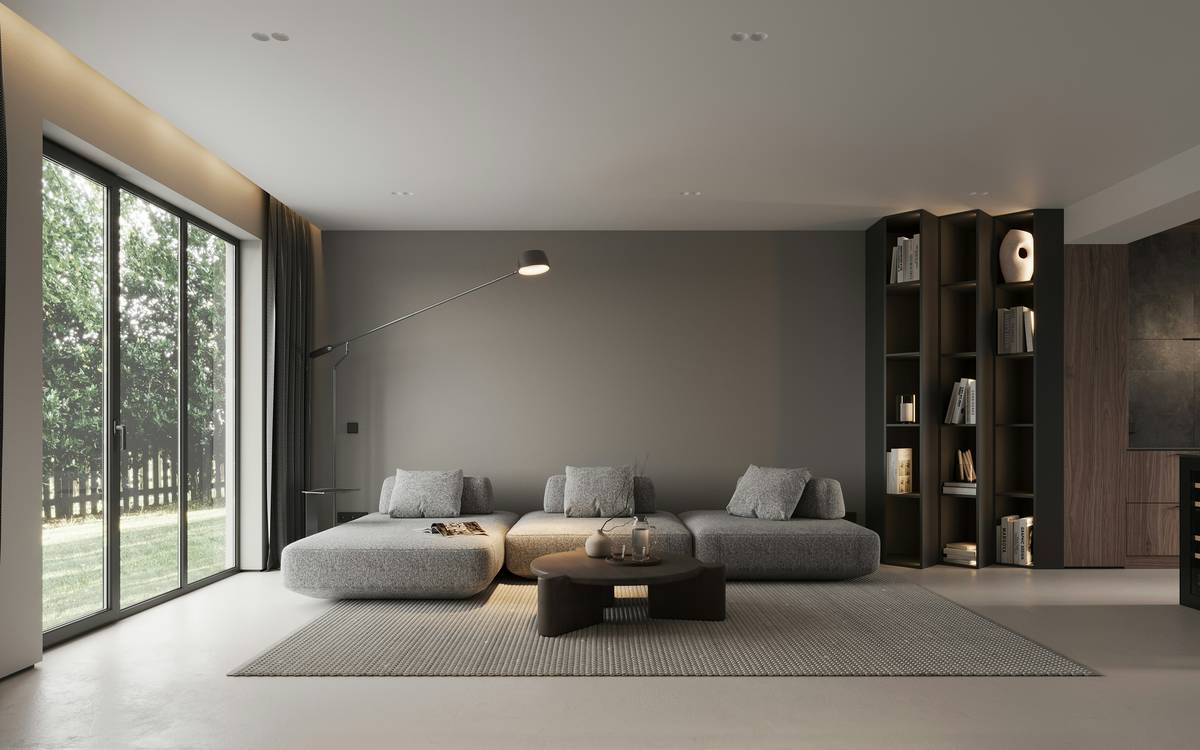
Example 1: The Sage Green Smart Couch
Sarah from Seattle upgraded her living room with a sage green smart sectional featuring built-in charging ports. Paired with soft linen drapes and raw wood side tables, her space transformed into an Instagrammable haven.
Example 2: Walnut and Copper
James combined a walnut dining table with copper LED strip lights underneath. Guests rave about his “chef’s kiss” combination of elegance and innovation.
FAQs on Smart Furniture Color Trends
Q: Are bright colors totally out for smart furniture?
A: Not entirely! Bright pops can accent neutral bases—just use sparingly.
Q: What’s the easiest color trend to start with?
A: Earthy greens like olive or moss—they match almost any style effortlessly.
Q: Can I mix metal finishes safely?
A: Yes! Just keep them in the same family (e.g., warm metals like brass and gold).
Conclusion
Smart furniture doesn’t have to sacrifice style for substance. By embracing trending colors like sage green, walnut, and muted metallics, you can create spaces that truly wow. Remember: less bling, more balance—and always sip coffee while redecorating. Trust me.
Like planting seeds in spring,
Tech meets tone—your home will sing.
Smart furniture, done right.